I never knew there was a Pantone Color of the Year until I started quilting again. And I never paid much attention to it until last years furor over Marsala (see here, here, and here).
This year seems as it will be just as controversial because Pantone picked Rose Quartz and Serenity for 2016. The first time that they have pick two colors, Pantone has this to say about them:
"As consumers seek mindfulness and well-being as an antidote to modern day stresses, welcoming colors that psychologically fulfill our yearning for reassurance and security are becoming more prominent. Joined together, Rose Quartz and Serenity demonstrate an inherent balance between a warmer embracing rose tone and the cooler tranquil blue, reflecting connection and wellness as well as a soothing sense of order and peace.
The prevalent combination of Rose Quartz and Serenity also challenges traditional perceptions of color association.In many parts of the world we are experiencing a gender blur as it relates to fashion, which has in turn impacted color trends throughout all other areas of design. This more unilateral approach to color is coinciding with societal movements toward gender equality and fluidity, the consumer's increased comfort with using color as a form of expression, a generation that has less concern about being typecast or judged and an open exchange of digital information that has opened our eyes to different approaches to color usage."
Already, some people hate it and some people love it (or at least tolerate it).
I totally disagree on the message that Pantone says that the colors carry. I get that this is a cheerful, optimistic view for how they hope these colors might make the world feel, perhaps heal, and that's what they think consumers will be wanting. My thought is that's a bunch of BS, personally. A nice thought, certainly, but all wrong for 2016. If we are basing the color of the year on the political/social feelings and environment for the year ahead I would have gone with Mean Red (a color I would describe as blacker than blood, the color behind your eyes when you brace yourself after hitting your thumb with a hammer, or the color thumping through you head when you have a case of the "mean reds" [Maybe I should be more hopeful and this year's color should have been Tiffany's Blue]). Consumers are scared, sad and angry. I would have liked to see the Color of the Year reflect that.
Then you have all that stuff about gender exploration, expression and diversity. Pantone is saying that the blurring of gender in fashion and society, and the acceptance of that blur, should be represented by the outdated, singleminded, restrictive, old fashioned, specifically gender binary, "baby" blue and pink? Huh?
This is a tougher issue for me to pick a color to represent. Purple doesn't work, bc that's still buying into the gender binary, which hopefully we have all realized doesn't apply. Rainbow is more traditional but not right for the year ahead (re my thoughts above). I think I might pick Everything Brown, the color you get when you mix all the paint on the palate, the color of earth, where everything and everyone sprouts from. For me, this year, Everything Brown would represent a joining, coming together of all genders, no matter what they are, all peoples, no matter who they are, unity.
Anyway, enough politics.
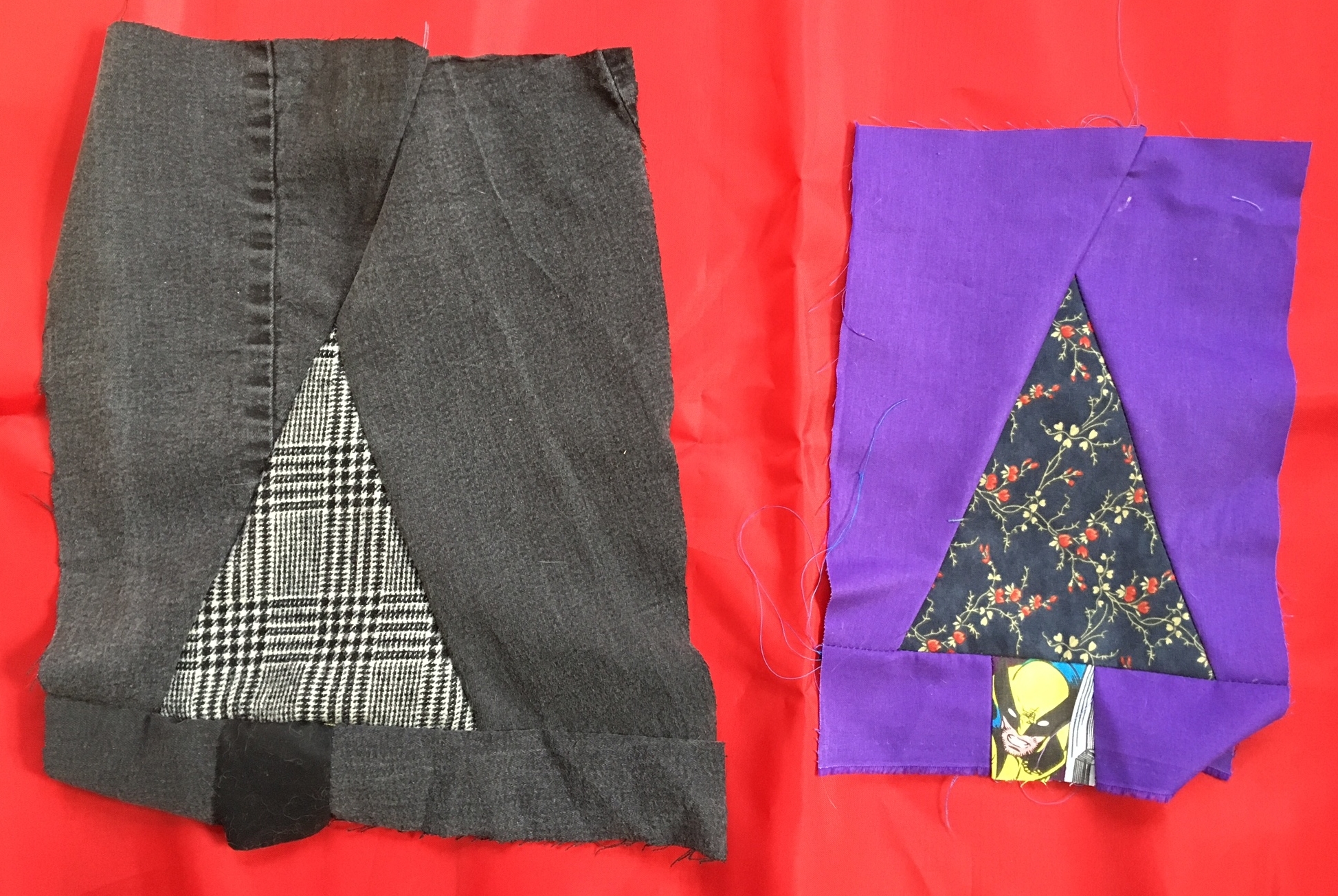
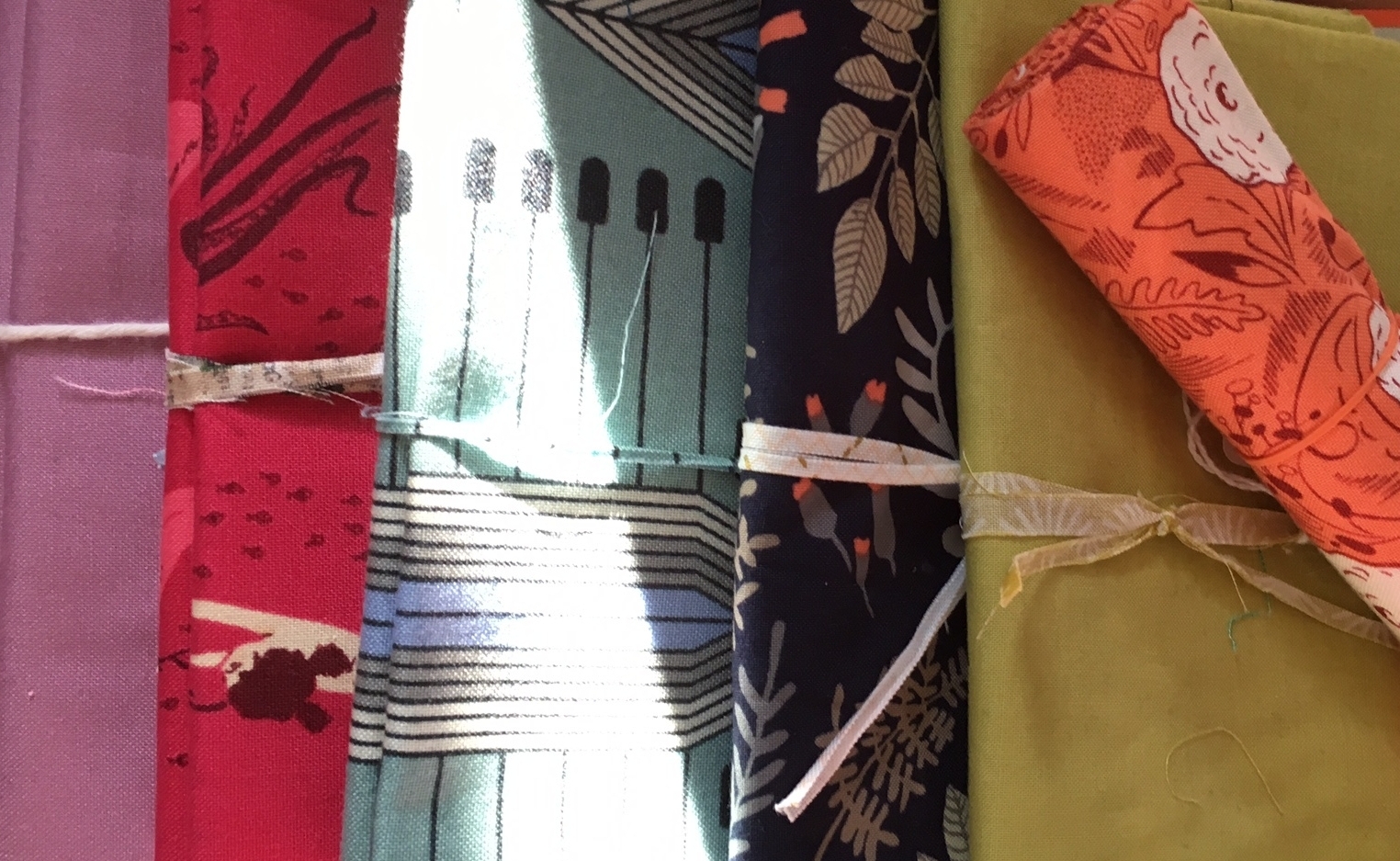
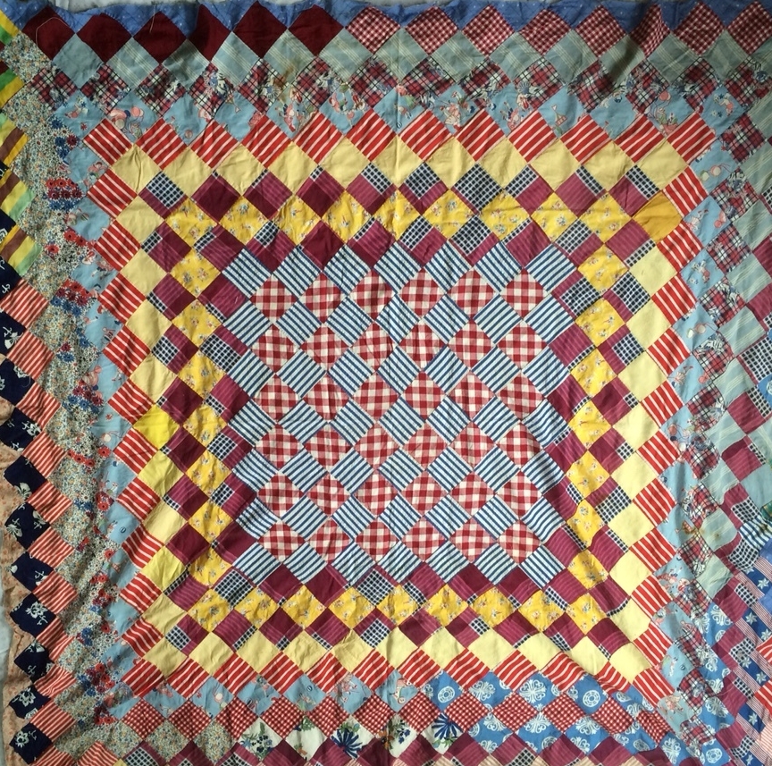
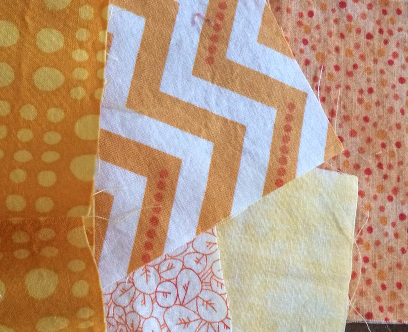
As for the colors, I'm right in the middle. I really enjoy Rose Quartz, but I'm not sold on Serenity. To further investigate, I did a little fabric pull.


