Pantone Color of the Year 2020: Classic Blue

Each year Pantone, the paint and color people, choose a color in December for the year ahead. They imbue these colors with ideas and ideals for the new year. I don't always agree with the choices but along with many in the quilting community, I like to ruminate on them a bit.

pantone-color-of-the-year-2020-classic-blue-banner.jpg

The Pantone color of the year for 2020 is Classic Blue.

Here is what they say about it:

“Instilling calm, confidence, and connection, this enduring blue hue highlights our desire for a dependable and stable foundation on which to build as we cross the threshold into a new era… Imprinted in our psyches as a restful color, PANTONE 19-4052 Classic Blue brings a sense of peace and tranquility to the human spirit, offering refuge. Aiding concentration and bringing laser like clarity, PANTONE 19-4052 Classic Blue re-centers our thoughts. A reflective blue tone, Classic Blue fosters resilience… As technology continues to race ahead of the human ability to process it all, it is easy to understand why we gravitate to colors that are honest and offer the promise of protection. Non-aggressive and easily relatable, the trusted PANTONE 19-4052 Classic Blue lends itself to relaxed interaction. Associated with the return of another day, this universal favorite is comfortably embraced.”

I’ve pondered Classic Blue for almost two months.

Generally I have a pretty quick response to the Color of the Year. Usually a negative one. I tend to vehemently disagree with the statement and mission that Pantone puts out. This year it took me much longer to decide how I feel.

My first thought is that I like this color. I’m often indifferent to the actual color of the Color of the Year. But Classic Blue is calming; it reminds we of the deepening blue of a late spring or early summer sky, cloudless and intense. The feeling you get when you’ve gone thru your whole day and for some reason you glance up, maybe a noise attracted your attention, maybe your in the middle of a memory and your head tilts up in thought, and there it is, a perfectly blue sky. And the feeling that the color inspires is so all encompassing, washing over your body, spirit and mind. It is uplifting, humbling, and expansive all at the same time. It may be, as Pantone suggests, a peaceful color, but it is at the same time a color that makes one think of the vastness of sky, ocean, and time, and how small your part in that expanse can be .

One tiny indistinguishable drop in an enormous endless bucket.

To me, this feeling is comfortable, re-centering, bringing a sense of peace and tranquility, just like Pantone intends. The idea that we are all the same, and all only a part of something far bigger and more important than the individual. This might not be exactly what Pantone meant, but to me this is the most relevant message to what’s happening in the world that Pantone has come up with in recent years. With world leaders making choices that strip away our rights, and divide us, with a shift to a “me me me” mentality, we need a reminder that everyone is connected and everyone needs to be able to relate to each other and put themselves in other people place. No one is special, no one is different, look at a stranger as you would look at yourself.

Overall, I really like classic blue and hope that Pantone, is right and this can be an awaken, centering, joining, strengthening year for all as a whole. That the larger community can leave the individual behind and come together to create better things.

What does Classic Blue make you think of or feel?

Pantone Color of the Year 2019

Each year Pantone, the paint and color people, choose a color in December for the year ahead. They imbue these colors with ideas and ideals for the new year. I don't always agree with the choices but along with many in the quilting community, I like to ruminate on them a bit.

For 2019, Pantone chose Living Coral.

Here’s what they have to say about it:

“Vibrant, yet mellow PANTONE 16-1546 Living Coral embraces us with warmth and nourishment to provide comfort and buoyancy in our continually shifting environment.

In reaction to the onslaught of digital technology and social media increasingly embedding into daily life, we are seeking authentic and immersive experiences that enable connection and intimacy. Sociable and spirited, the engaging nature of PANTONE 16-1546 Living Coral welcomes and encourages lighthearted activity. Symbolizing our innate need for optimism and joyful pursuits, PANTONE 16-1546 Living Coral embodies our desire for playful expression.

Representing the fusion of modern life, PANTONE Living Coral is a nurturing color that appears in our natural surroundings and at the same time, displays a lively presence within social media.

PANTONE 16-1546 Living Coral emits the desired, familiar, and energizing aspects of color found in nature. In its glorious, yet unfortunately more elusive, display beneath the sea, this vivifying and effervescent color mesmerizes the eye and mind. Lying at the center of our naturally vivid and chromatic ecosystem, PANTONE Living Coral is evocative of how coral reefs provide shelter to a diverse kaleidoscope of color.”

I may seems like a downer when it comes to Pantone’s color of the year. I started examining it and sharing my thoughts in 2016 and I’ve disagreed with the meaning or idea behind just about every color since. Serenity and Rose Quartz (2016) felt confining in it’s binary structure (at a time when we should be seeing past blue and pink), Greenery (2017) felt tone deaf in it’s optimism in nature as opposed to the world-leader’s intent to destroy it, and Ultra Violet (2018) would have made more sense if they had called it Ultra Violent (I mean, it was the year with the most mass shootings in the US so far).

I’m sure that Pantone intends these colors to be uplifting and inspiring.

But come on!! At a time when most of the world coral reefs are headed soon to destruction, when the US is actively repealing environmental safeties and sustainability, Pantone is going to say looking at an intestinal putrid pink is going to save us from the fantasies of the internet and connect with nature and the world??

But perhaps it is all in the name. If it had been called Puke or even Drink the Koolaid or Road Kill, I might have felt it was more appropriate for what we have to face in the coming year.

If this is our color of the year, let it be named Extra Strength Pepto Bismol. Pantone, help me stomach another year like the last few.

pantone-color-of-the-year-2019-living-coral-tools-graphics-packaging.jpg

But don’t take my word for it. Here are a few articles on Living Coral

From Tree Hugger (you know I love them!)

NJ News likes it bc it’s from NJ!

I always love to read what A Quilter’s Table has to say about the Color of the Year.

Well and Good thinks Living coral is … sexy?

I really like what Thrillist says: “it's not a reflection, it's a response -- an answer”. I personally can’t seem to get that point, but I want it to be true!

What are your thoughts on Living Coral?

Screen-Shot-2018-12-12-at-10.27.17-AM.png

New Block: Honey Bee Block (Solstice Block 14/25)

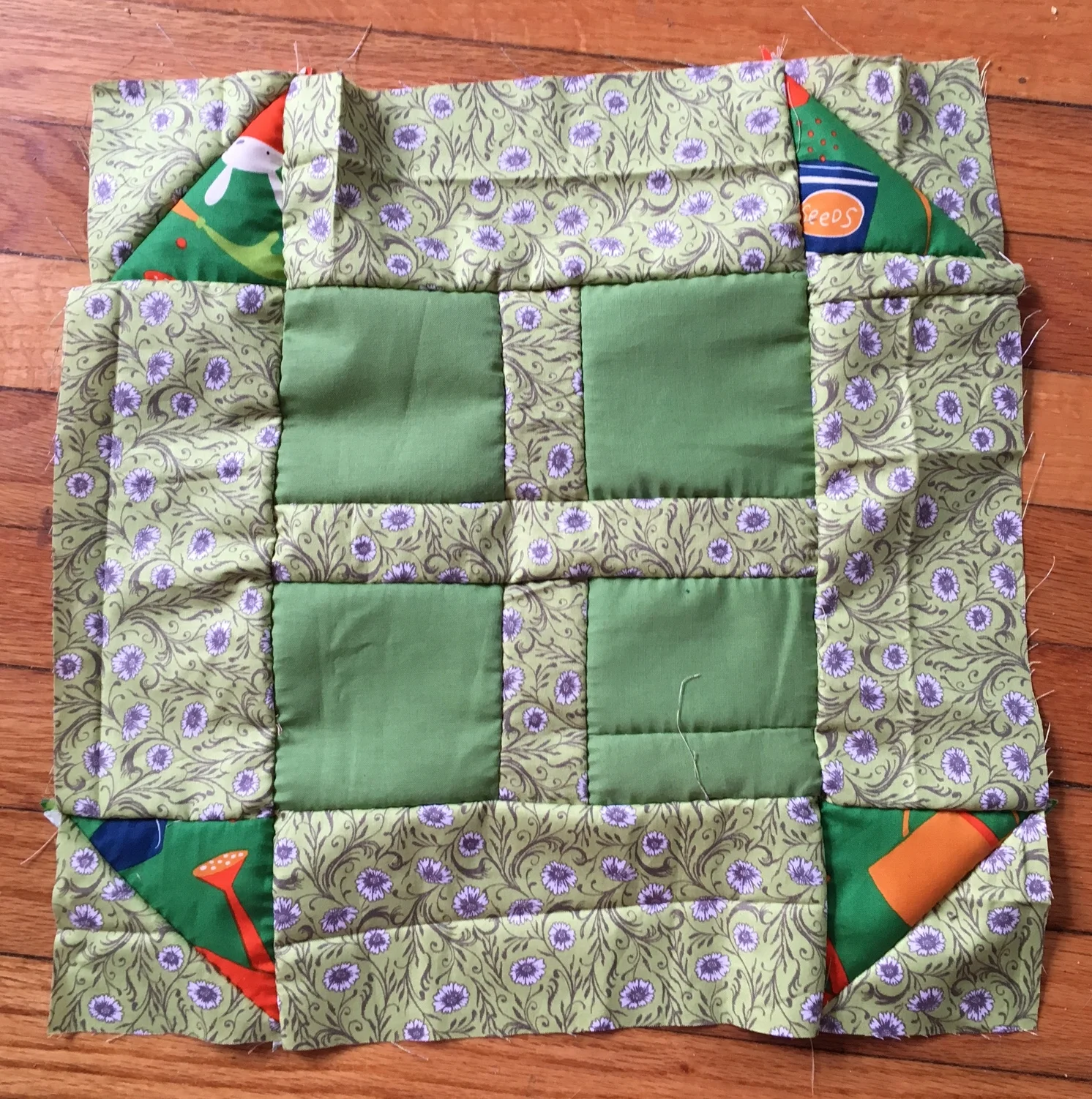
Here is another block I heavily modified for Pat Sloan's Solstice Challenge. Her Honey Bee block called for appliqué, ut I chose to make some orange peels instead. 

IMG_4947.JPG

Her block also called for petals or peels at all four corners, but three were enough for me. I'll need to sweep some threads off this block and square it up, but I'm pretty happy with how it came out! 

Linking top with Finished or Not It's Friday, Needle and Thread Thursday, Slow Sunday Stitching and  more! 

6a00d8341c976153ef01bb0964599f970d-500wi.png

Solstice Challenge Check In

I've gotten a bit behind in Pat Sloan's Solstice Challenge. But It's given me some time to play around with layout and arranging the blocks. 

It's exciting to see a chunk of the blocks together and to imagine what the final piece may look like. I'm liking the idea of these blocks being all joined up with no sashing. Seeing them laid out makes me realize what colors I'd like to add more of. 

Has anyone else participating in this challenge thought out lay out yet?

Linking up with Monday Making, Move it Forward Monday, BOMs Away, and more!

New Block: Studio Time (Solstice block 13/25)

I'm still trying to catch up on the Solstice Challenge, but I'm getting there one block at a time. Studio Time is another great name for a block.  

IMG_4305.JPG

I like that there are a few variations of nine patches in Pat Sloan's BOM. I'm excited to see all the blocks together. Who else is working on this BOM? Are you planning to use the planned layouts? Or are you gonna come up with your own?

New Block: Jacob's Ladder (Solstice Block 12/25)

I'm making so many new blocks as part of Pat Sloan's Solstice Challenge! Looking around, there seem to be a few variations of this classic block. This one was pretty easy to make and came together quickly!

IMG_3837.JPG

I cut the pieces for this block at home then pieced it on a bus ride! It came out a wee bit smaller than most of the blocks. I never can tell!!

Linking up with Making Monday, Move It Forward Monday, etc...

New Block: Quilt Math (Solstice Block 11/25)

I was pleased to see the name of the 11th block for Pat Sloan's Solstice challenge bc "quilt math" is something I never do. I never use a ruler or other measuring tools when hand sewing and quilting. Quilt math is something I see many quilters get frustrated about, but not me! 

IMG_3759.JPG

This was a fun block to make and come together quickly. This is another block I could see repeated to make a fun and geometric full quilt. 

Linking up around blog land. What are your favorite block link parties?


New Block: The Coffee Shop (Solstice Block 10/25)

The Coffee Shop Block, block 10 of the Solstice Challenge, is pretty similar to other blocks I've made, but bc of it's boarders, I'm still calling it a new block. It's basically a fat plus block (not sure if there's a real name for that) with little boarders, but playing with color really changes this block's look. 

IMG_3632.JPG
Pat Sloan's Coffee Shop Block.

Pat Sloan's Coffee Shop Block.

Look at how Pat made her version so that the borders become a sort of echo (at right). It's hard to believe how different our two blocks look. I might try that next time. I could picture many variations of this block to make a full quilt. 

Since I only eyeball the measurements in quilting, this block turned out quite a bit bigger than the others I have made so far. As usually, I'm not worried about it now, I'm sure everything will fit together in the end. 

I'm linking up with Kathy's Slow Sunday Stitching, Monday Making, Move It Forward Monday, Tuesday Building Blocks and more!

New Block: Among the Stars Fraction (Solstice Block 9/25)

For the 9h block of Pat Sloan's Solstice Challenge, she chose a large block, or a small block with many parts, depending on how you look at it. Since I am making all my block around the same size, I didn't want to cut a million teeny HSTs or make an extra large block. Instead, I modified the pattern, using only a fraction of the whole block. 

IMG_3635.JPG

I LOVE the way this block came out and I could see doing a whole quilt with just these stretchy stars! I also designed a second fraction of this block that I might also make. I think I will wait to see what the finished quilt might look like first before I do, though. I'm holding on to it in case I need extra blocks depending on how I choose to set them all. 

Linking up with Building Block Tuesday, Slow Sunday Stitching, Monday Making, Move It Forward Monday, MCM, and more. 

New Block: Never Ending Love (Solstice Block 8/25)

This was another block from Pat Sloan's Solstice Challenge that called for appliqué. 

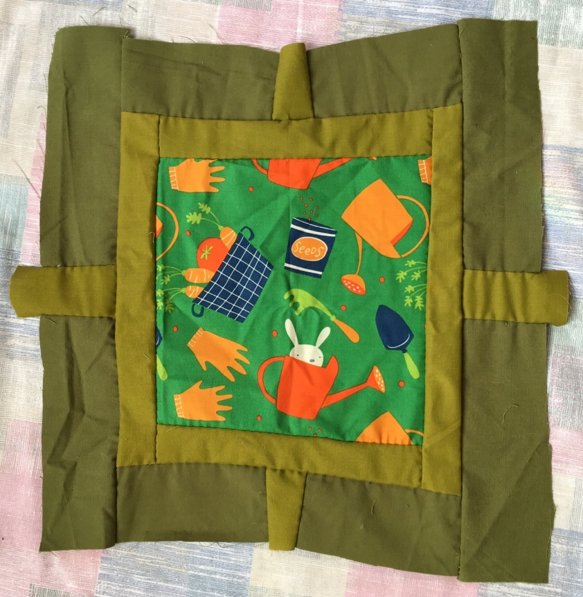
And it's another block where I opted to leave that appliqué out. It's still a new block for me without it and I really like this one! I can very easily see incorporating this block into other quilts. For this and the other block that were supposed to be appliquéd, I used an eye catching fabric for the center of the block. I haven't begun to look at the blocks together to see how the ideas I have might fit into the over all setting of the quilt. But I think having two blocks with these fabric as focal points might work nicely. 

New Block: Tidy Rows (Solstice Black 7/25)

I put off doing Tidy Rows for a little while bc of all the HSTs. But I ended up really loving this new block. 

I have really been enjoying seeing what new block comes for the Solstice Challenge each week. Although one of the quilt settings calls for several different sizes of blocks, I have been making them pretty much the same. I'm not sure how it will look in the end, but I have a feeling that I will really enjoy this quilt once it is all put together.

I'm linking up with Slow Sunday Stitching, Move it Forward Monday, and more.